Niche magazine design is by definition unique to each individual publication, so no general suggestions apply. These magazines target a small and distinct audience. The key is to find a look that appeals to readers interested in that subject. You might start with design inspiration from national publications focused on similar content, then customize for your niche project’s audience.
One winning combination is to devise a distinctive page layout and use it within a traditional magazine structure. To do this, craft distinctive head treatments and typography that relate to the content and will resonate with readers interested in the topic. But whatever you choose to do to express the unique nature of your niche project, always be driven by the content and advancing its storyline.
Art director’s notes: The portfolio samples below are from niche pubs targeting seniors, brides, and veterans, just to name a few we’ve done. I’ve added some thoughts on design for each niche.
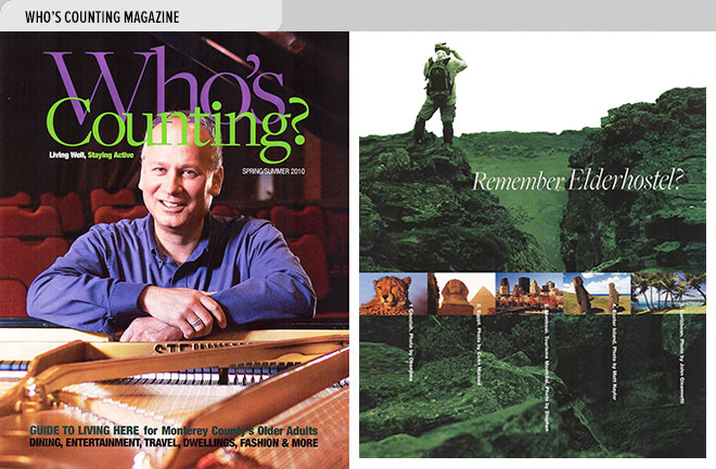
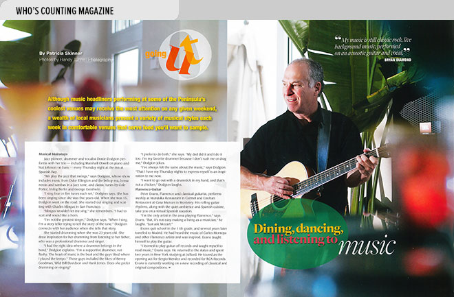
Who’s Counting: We created features of interest to younger, active seniors and used contemporary type treatments and full page photos in this redesign of Sixtyfive Plus magazine. Changing the title to Who’s Counting breathed new life into the pub and inspired the rest of the design changes.
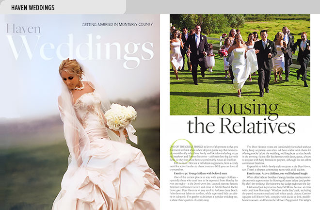
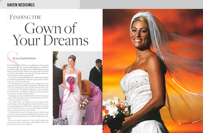
Haven Weddings: In this niche magazine design field, tradition definitely drives design. Readers want and expect that. So bring on the full page spreads with brides in their gowns, flowers, fabulous weddings venues in scenic settings, and the latest in cake design, reception décor, invitations and favors. A touch of script type won’t hurt either.
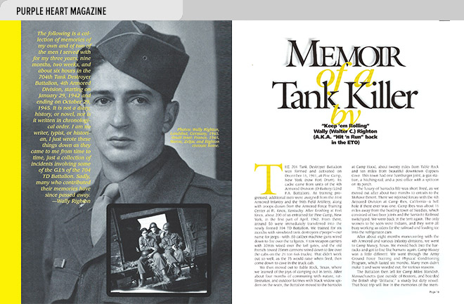
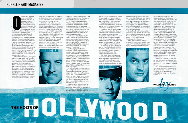
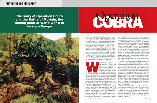
Purple Heart: A classic approach to typography was chosen for this veteran’s magazine redesign to create a strong, dignified layout with emphasis on the stories Purple Heart recipients tell about combat. The intent was to honor them and show respect for the sacrifices made.
- Left, cover of Who’s Counting with pianist Rick Yramategui at Hidden Valley, Carmel Valley, CA (Photo by Randy Tunnell); right, photos and article about Exploritas (was Elderhostel) world tours for older adults (article by Patricia Skinner).
- An article by Patricia Skinner about local dining and entertainment venues suited to older adults is illustrated by a photo of guitarist Bryan Diamond playing on Cannery Row in Monterey, CA (photo by Randy Tunnell).
- Left, cover of Haven Weddings (photo by Natalie Taggart); right, article by Laura Cameron about options for housing wedding guests (photo by Marc Howard).
- Left, article by Lisa Crawford Watson with tips on how a bride can find the perfect wedding gown (left, photo by Amy Fuller; right, photo by Tom O’Neal).
- A spread from a veterans’ magazine featuring an article by Wally Righton about his service in WW II with the 704th Tank Destroyer Battalion, 4th Armored Division, with photos of Righton from the period.
- A spread from a veterans’ magazine featuring three generations of a Hollywood acting family’s military service; Tim Holt (center) was the young prospector in the classic film, Treasure of Sierra Madre.
- Spread from a veterans’ magazine with an illustration and article about the role played by Operation Cobra in the Battle of Mortain, the turning point of World War II in Western Europe.
