Health magazine design as a separate genre is a relatively recent phenomenon. New health magazines debut routinely, looking to maximize the readership potential of the national obsession with health and fitness. Most are gender specific, with typography and layouts reflecting the bias. Not surprisingly, those targeting women use design conventions borrowed from the beauty and fashion industries. Men’s health magazines tend to go for a macho look, using bold type and graphics that suggest virility and strength. But there are exceptions.
Typically, spreads are complex mixes of short text blocks and infographics, with lots of photos of beautiful people being active. Some health magazines continue in that vein throughout. Others also have article sections in which simple text pages contrast with striking full page photos. There is no one traditional look, and only passing references to formulaic design solutions. Health magazine design is a great opportunity to step outside of the box and invent.
Art director’s notes: General health magazines are seen mostly on the national level. They cover only health and medical issues that affect many, or topics that are in the public eye for some reason. On the regional level there are fewer people, so often there isn’t enough readership to support a separate health publication. For that reason, health magazines published on the regional and local level often appear as a special issue or section of a larger publication, rather than as standalone publications.
Local area medical professionals and hospitals may provide financial support to these publication through their advertising buys. That may mean stories about them, in turn, are featured as part of the magazine’s content. Whether that happens or not, the content will reflect medical practices in the area, and may not be inclusive. But it’s still an effective way for readers to learn more about their local healthcare options and practitioners.
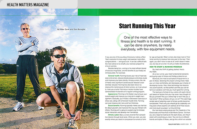
- Runners and fitness columnists Mike Dove and Don Buraglio authored this article on how to get started running, the best places to run, and Monterey Bay area groups you can run with (photo by Randy Tunnell). randytunnell.com
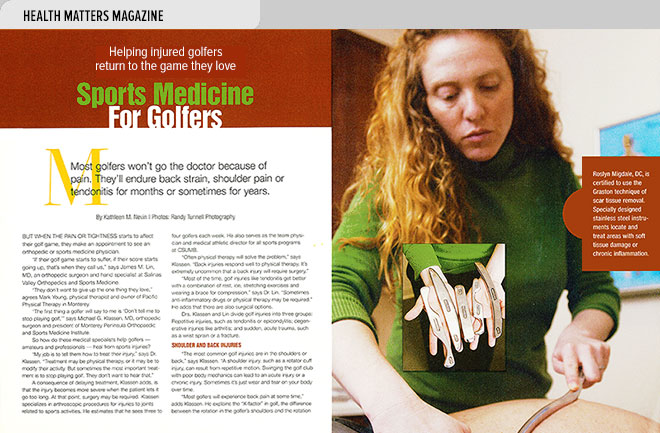
- The author interviews area sports medicine specialists to learn how they help players heal from golf injuries (article by Kathleen M. Nevin, photos by Randy Tunnell).
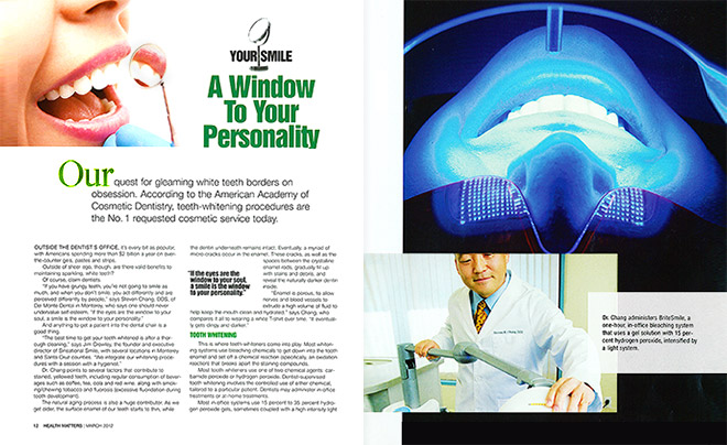
- Author Mike Hale covers options and best practices for teeth whitening in the Monterey Bay area. Inset photo shows a dentist using a light-activated bleaching system on a patient’s teeth (photo by Randy Tunnell).
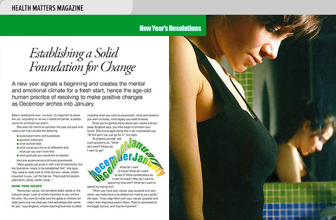
- This article by Sandra Leader explores ways to make New Year’s resolutions that you can keep, and tells how to increase the likelihood that your positive changes will last all year.
- A spread that focuses on children’s fitness looks at the benefits of different kinds of exercise for children, as well as the best protective eyewear for those who play sports (articles by Lisa Crawford Watson, left, and Judie Marks, right).
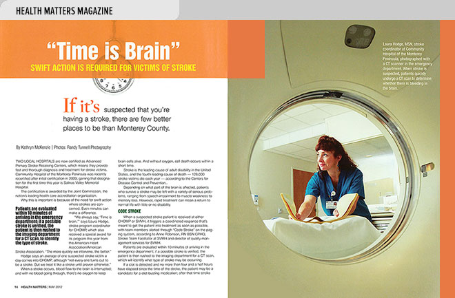
- This is the story of two area hospitals and how their fast and thorough treatment for stroke victims minimizes long term impairment (article by Kathryn McKenzie, photo by Randy Tunnell).
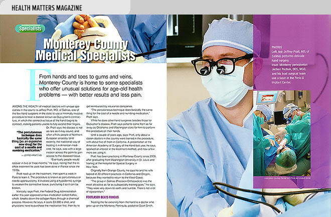
- The author interviews medical specialists in the Monterey County area who offer some unusual solutions for age-old health problems (article by Judie Marks, photos by Randy Tunnell).
