Event program design takes its cue from the nature of the event itself. You’d create an elegant program for an elite food and wine festival. And go for something dynamic for a sports event. That’s obvious, but not so obvious is that format goes beyond graphics, page layout and typography. Start with page size. A small program you can slip into a pocket works best for a walk-around event: larger sizes are practical when attendees are seated or stay in one area. Some programs are more commemorative in nature, meant more to remember the event by than to guide you through it.
Form follows function, as the saying goes. That’s the key to event program design too. The designer should consider whether people will move through different venues, or stay in the same area. If they move, how do you guide them to the right place at the right time? Will there be signs that do that, or are they dependent on the program info? Before you start, get clear on exactly what the program needs to do.
Art director’s notes: After the above, consider the best sequence of the program’s sections. If there is an event schedule, place it where it is easy to find, at the front or center. Pull outs are an option if you have the budget and time. Different colored tabs printed on the page and bleeding off the edge make key content easy to find. For programs beyond pamphlet size, always include a contents page as close to the front as possible.
Often programs contain articles about the event’s history and past and present participants. Design of the articles section can mesh with the overall design, or contrast to set it apart. Article layouts are also more flexible than information pages, and can be helpful if adjusting page count becomes necessary. Photo spreads are an effective way to add pages, and even more flexible because you can use those photos in whatever size necessary to fill.
For most events, sponsors are a key part of the show. They man exhibits, give presentations and host functions. That makes sponsor ads a huge part of the program. You’ll want to keep sponsors happy by making sure their ads are well presented, so use a page size large enough to do them justice, good stock and a quality print house.
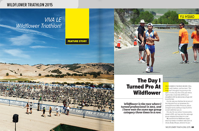
- This spread from the Wildflower Triathlons Program tells the story of the day in 2013 that triathlete Yu Hsiao, shown running in the photo at right, turned pro at Wildflower.
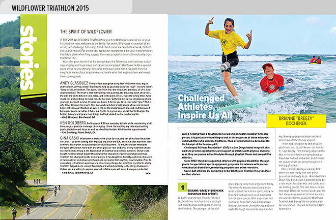
- Left, intro to the stories section of the Wildflower Triathlons Program. Right, challenged athlete Brianne “Breezy” Bochenek competes despite a leg lost to bone cancer.
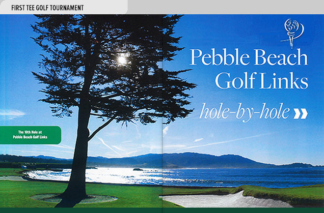
- This spread from the First Tee Golf Tournament program introduces a section of photos and statistics on each of the eighteen holes of the Pebble Beach Golf Links (photo by Vern Fisher). corbisimages.com/photographer/vern-fisher
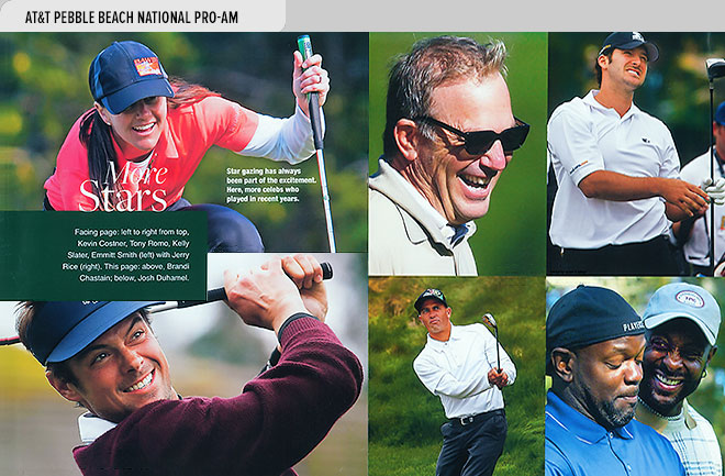
- This spread from the AT&T Pebble Beach National Pro-Am program features celebrities who have played the Pro-Am, including Brandi Chastain, Josh Duhamel, Kevin Costner, Tony Romo, Kelly Slater, Emmitt Smith, and Jerry Rice.
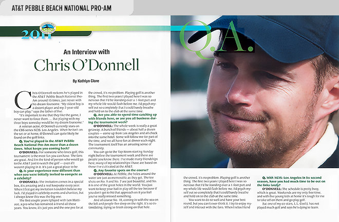
- This spread from the AT&T Pebble Beach National Pro-Am Program features a photo and interview of veteran actor and amateur golfer Chris O’Donnell, who has played in the Pro-Am fifteen times (article by Kathlyn Clore).
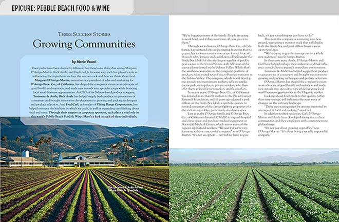
- This spread from Epicure, the Pebble Beach Food & Wine official program, tells the story of three key corporate sponsors who have helped shape the event, with sponsor Tanimura & Antle’s lettuce fields in the background.
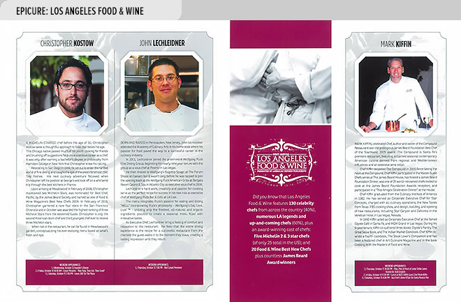
- This spread from Epicure, the official program of Los Angeles Food & Wine, profiles chefs Christopher Kostow, John Lechleidner, and Mark Kiffin, and gives information on their appearances at LAFW, an offshoot of the Pebble Beach Foot & Wine event.
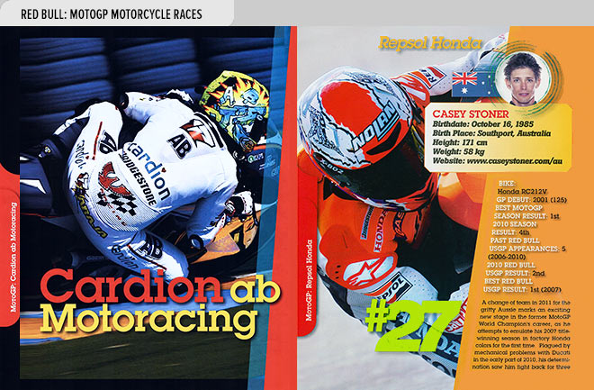
- Pages from the Red Bull MotoGP Motorcycle Races program highlight competing teams and profile team members, including team Cardion ab Motoracing and Casey Stoner of Repsol Honda.
