Home magazine design publications are strongly influenced by tradition. In this genre, you often see layouts with full page photos across the spread. Photos are shot from a perspective that lets readers easily visualize entering the room and walking through to take a seat. That device alone captivates attention beyond the actual content shown. Other devices, like printing captions and text on a photo, allow more space for the image. Drop caps are almost de rigueur, it’s rare to see a home magazine without them.
The idea with home magazine design is more to work within this tradition than to invent a new expression of the genre. It gives readers a sense of the familiar and creates a continuum of interior design gorgeousness that enhances the immersive nature of the experience.
Art director’s notes: Art director’s notes: Haven, a home and garden magazine, was the first launch of a newspaper company’s initiative to produce high-end, content-specific publications in the style of newsstand products. The quality reproduction needed was beyond the capability of the paper’s newsprint presses, so it was printed by an outside print vendor specializing in web offset periodicals. We chose high-grade white matte stock for the inside initially, gloss for the cover, and it was perfect-bound. The brief was to create a high-end advertising vehicle, and we did.
Photos for each story were assigned to the best freelance photographers in the area. You can see the stunning results in the spreads below. Haven’s format used the same design conventions and typography found in national newsstand home magazines. That was intentional, to deliver the look fans of that genre expect.
What made Haven unique is the all-local content. It features the homes and gardens of the Monterey Bay area, and the work of the architects, interior designers, and craftsmen who live there. By staying true to that content and telling their stories, we achieved a one-of-a-kind product in line with the best traditions of its genre – but with it’s own personality.
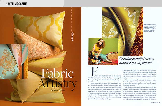
- A nationally recognized textile designer, Nomi Franklin creates art fabrics in her Watsonville, California production studio. This is her story and some of her fabric designs (article by Renee Brincks, photos courtesy Nomi Fabrics).
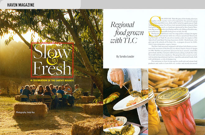
- The slow food movement is the topic of this article covering a fundraising event sponsored by Slow Food of Monterey Bay at Triple M Ranch, Las Lomas, California (article by Sandra Leader, photos by Andy Rea).
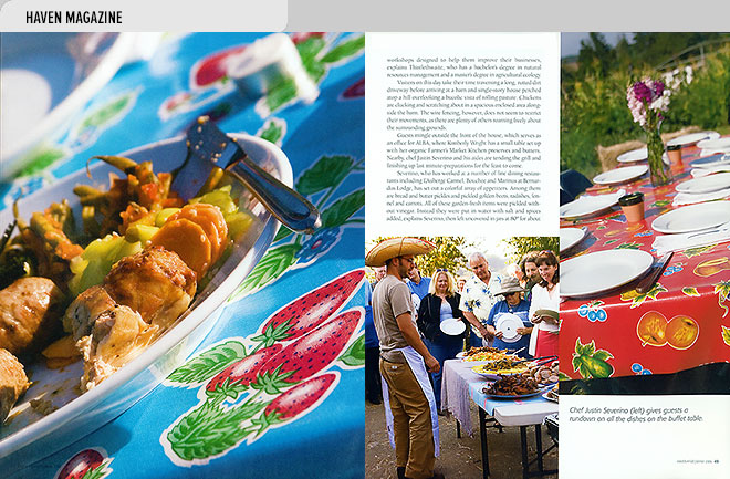
- This is the next spread of the slow food article by Sandra Leader covering a fundraiser held at Triple M Ranch, Las Lomas, California (photos by Andy Rea).
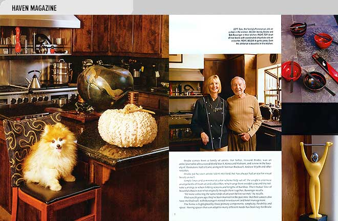
- This spread features Monterey Bay chef and TV cooking show host Wendie Brodie and her husband, Bob Bussinger, in their Carmel, California area home (article by Sandra Leader, photos by David Royal).
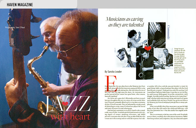
- A spread featuring local Monterey Bay area activities tells the story of jazz musicians who support the community’s needy through performance (article by Sandra Leader, photos by Tom O’Neal). tgophoto.com
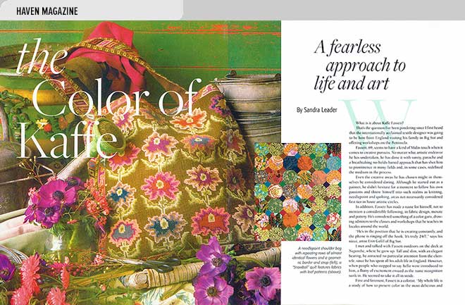
- This spread features textile and knitting artist Kaffe Fassett. Fassett’s family founded famed Nepenthe restaurant overlooking the Big Sur, California coast (article by Sandra Leader).
